Tampilkan postingan dengan label NASA. Tampilkan semua postingan

Sabtu, 06 April 2013

How much will temperatures rise?

If we take the NASA Annual Mean Land-Ocean Temperatures and draw a projection into the future, temperatures will quickly be 3 degrees Celsius higher than the base period (1951-1980), i.e. well before 2050, as illustrated on image 1. below. 

Image 1. Temperatures will be 3 degrees Celsius higher well before 2050

Above projection appears to be steeper than even the worst-case scenario pictured by the IPCC for years, such as on the image below.

Image 2. from IPCC 2001. Projections of globally averaged surface temperature 2000-2100 are shown for six SRES scenarios and IS92a using a model with average climate sensitivity. The grey region marked "several models all SRES envelope" shows the range of results from the full range of 35 SRES scenarios in addition to those from a range of models with different climate sensitivities. The temperature scale is departure from the 1990 value.
Could temperatures rise faster in future than what the IPCC anticipated in 2001? The answer must be yes! In 2007, the IPCC described that, even if greenhouse gas concentrations in the atmosphere were stabilized for 100 years at year 2000 values (B1), then we would still be committed to a further warming of 0.5°Celsius. This committed warming should not be confused with ‘unavoidable climate change’ over the next half century, which would be greater because forcing cannot be instantly stabilized. And of course, as it turned out, emissions have not been stabilized at 2000 values, but have in fact increased substantially.

As it turned out, the models used by the IPCC made all kinds of assumptions that didn't eventuate. But before deciding to instead settle for a relatively simple extrapolation of observed data, there are some issues that require a further look.  

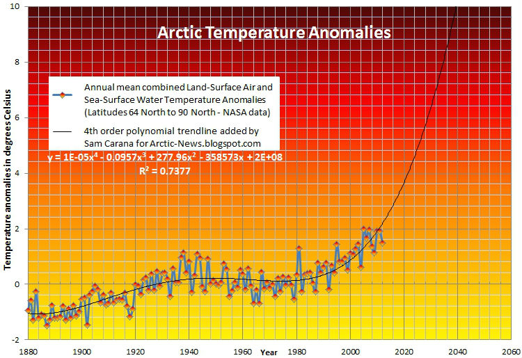
As discussed in the earlier post Accelerated Arctic Warming, temperatures in the Arctic have been rising at a much faster pace than global temperatures, and if this accelerated rise continues, we can expect a 10 degrees Celsius rise in the Arctic before 2040, as illustrated by image 3. below.  

Image 3. Three kinds of warming - 2: Accelerated warming in the Arctic 
Such a temperature rise in the Arctic will undoubtedly lead to additional greenhouse gas emissions in the Arctic, of carbon dioxide, nitrous oxide and particularly methane, threatening to trigger runaway global warming. 

The image below, from the methane-hydrates blog, combines these three kinds of warming, showing global temperatures that soon catch up with accelerated Arctic warming, as heatwaves at high latitudes will cause wildfires, in particular in Siberia, where firestorms in peat-lands, tundras and forests could release huge amounts of emissions, including soot, much of which could settle on the Himalayan plateau, darkening the ice and snow and resulting in more local heat absorption. Rapid melt of glaciers will then cause flooding at first, followed by dramatic decreases in the flow of river water that up to a billion people now depend on for water supply and irrigation.

In other words, the situation looks much more dire than what most models make us believe; the more reason to adopt the climate plan that is also described at the post at the methane-hydrates blog.

Image 4. Three kinds of warming - 1, 2 and 3 


References

- IPCC (TAR) - Climate Change 2001: Synthesis Report

- IPCC (AR4) - Climate Change 2007: Working Group I: The Physical Science Basis

- Accelerated Arctic Warming

- Methane hydrates

Jumat, 22 Maret 2013

Arctic Ice Breaks Up in Beaufort Sea


The NOAA image below gives an update on the temperature anomaly over Greenland, as earlier discussed in the post including Huge patches of warm air over the Arctic.


Below a NOAA animation showing a 30-day loop (up to March 19, 2013) of analyzed 200-hPa heights and anomalies. An eleven-day mean, centered on the date indicated in the title, of 200-hPa heights and anomalies from the NCEP Climate Data Assimilation System (CDAS), is shown for the first 25 days of the animation. 10-, 9-, 8-, 7-, and 6-day running means are shown for the last 5 days, respectively. Contour interval for heights is 120 m, anomalies are indicated by shading. Anomalies are departures from the 1979-95 daily base period means.


As discussed in earlier posts (see below), changes to the jet stream are making extreme weather events increasingly likely to occur, which spells bad news for the sea ice.


Below a NASA video with satellite images showing the Arctic sea ice breaking up in the Beaufort Sea.


A series of intense storms in the Arctic has caused fracturing of the sea ice around the Beaufort Sea along the northern coasts of Alaska and Canada. High-resolution imagery from the Suomi NPP satellite shows the evolution of the cracks forming in the ice, called leads, from February 17 -- March 18 2013. The general circulation of the area is seen moving the ice westward along the Alaskan coast.


Finally, the Naval Research Laboratory animation below shows the thickness of the sea ice over the past 30 days.


Related posts

- Huge patches of warm air over the Arctic
- Polar jet stream appears hugely deformed
- Hurricane Sandy moving inland

Kamis, 17 Januari 2013

Accelerated Arctic Warming

The more northern we look, the more Earth is warming, as shown by the NASA image below.

global temperature anomalies averaged from 2008 through 2012, NASA Goddard Institute for Space Studies
The interactive image below shows temperature anomalies for the different latitudional zones over time.

The Arctic (red line above) clearly shows the strongest warming over time, while accelerating in recent years. The best fit for this warming in the Arctic is a fourth order polynomial trendline, as added to the data on the image below.


This accelerated warming in the Arctic is threatening to destabilize the methane in the seabed and trigger runaway global warming within a decade. Effective action needs to be taken before it's too late!

Rabu, 19 September 2012

NSIDC calls record 2012 low

This NASA satellite image shows how the Arctic sea ice extent, on Sept. 16, 2012, compares to the average
minimum extent over the past 30 years (in yellow). Credit: NASA/Goddard Scientific Visualization Studio.
Arctic sea ice cover likely melted to its minimum extent for the year on September 16, says the National Snow and Ice Data Center (NSIDC), adding the note that this number is preliminary—changing weather conditions could still push the ice extent lower.

Sea ice extent—defined by NSIDC as the total area covered by at least 15 percent of ice—fell to 3.41 million square kilometers (1.32 million square miles), now the lowest summer minimum extent in the 33-year satellite record.

NSIDC adds that this minimum is 49% below the 1979 to 2000 average, as illustrated by the table below.

Table 1. Previous minimum Arctic sea ice extents
 YEARMINIMUM ICE EXTENTDATE
IN MILLIONS OF SQUARE KILOMETERSIN MILLIONS OF SQUARE MILES
20074.171.61September 18
20084.591.77September 20
20095.131.98September 13
20104.631.79September 21
20114.331.67September 11
20123.411.32September 16
1979 to 2000 average6.702.59September 13
1979 to 2010 average6.142.37September 15

NSIDC adds that the six lowest seasonal minimum ice extents in the satellite record have all occurred in the last six years (2007 to 2012). In contrast to 2007, when climatic conditions (winds, clouds, air temperatures) favored summer ice loss, this year’s conditions were not as extreme. Summer temperatures across the Arctic were warmer than average, but cooler than in 2007. The most notable event was a very strong storm centered over the central Arctic Ocean in early August. It is likely that the primary reason for the large loss of ice this summer is that the ice cover has continued to thin and become more dominated by seasonal ice. This thinner ice was more prone to be broken up and melted by weather events, such as the strong low pressure system just mentioned. The storm sped up the loss of the thin ice that appears to have been already on the verge of melting completely.

NASA says that this year, a powerful cyclone formed off the coast of Alaska and moved on August 5 to the center of the Arctic Ocean, where it churned the weakened ice cover for several days. The storm cut off a large section of sea ice north of the Chukchi Sea and pushed it south to warmer waters that made it melt entirely. It also broke vast extensions of ice into smaller pieces more likely to melt.

“The storm definitely seems to have played a role in this year's unusually large retreat of the ice”, said Claire Parkinson, a climate scientist at NASA Goddard Space Flight Center, Greenbelt, Md. “But that exact same storm, had it occurred decades ago when the ice was thicker and more extensive, likely wouldn't have had as prominent an impact, because the ice wasn't as vulnerable then as it is now.”

In the press release, NSIDC lead scientist Ted Scambos said that thinning ice, along with early loss of snow, are rapidly warming the Arctic. “But a wider impact may come from the increased heat and moisture the warmer Arctic is adding to the climate system,” he said. “This will gradually affect climate in the areas where we live,” he added. “We have a less polar pole—and so there will be more variations and extremes.”

The image below, from Arctic Sea Ice Blog, shows Arctic sea ice observations (in red) against the backdrop of models used in IPCC AR4 (2007) for projection of sea ice up to the year 2100.


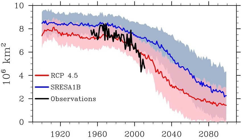
The image below, from NSIDC sea ice news, shows the observed September sea ice extent for 1952-2011 (black line) against a backdrop of projections used by IPCC AR4 (blue) as well as proposed for use in IPCC AR5 (red).

Note: The record low value for 2012 still has to be added on this image. Credit: NSIDC, Stroeve et al.
The image shows that the recently observed decline in sea ice extent is steeper than the CMIP3 models with a “business as usual” SRESA1B greenhouse gas emissions scenario (blue line), as used by the IPCC in AR4.

It is also steeper than the more recent CMIP5 models using a RCP 4.5 scenario (pink line) that are proposed to be used by the IPCC in AR5.

RCP 4.5 is a scenario in which the global temperature rise would would soon exceed 2 degrees Celsius. Since the Arctic experiences accelerated warming, such a scenario would clearly be catastrophic. Looking at sea ice volume, rather than extent, would show this even more clearly.

Below, a NOAA animation showing sea ice decline in 2012 and a NASA animation showing the Arctic cyclone.


Above animation shows the 2012 time-series of ice extent using sea ice concentration data from the DMSP SSMI/S satellite sensor. The black area represents the daily average (median) sea ice extent over the 1979-2000 time period. Layered over top of that are the daily satellite measurements from January 1 to September 14, 2012. Published September 17, 2012 by NOAA Visualizations.

Below the NASA animation
Arctic Cyclone Breaks Up Sea Ice

As said in the NSIDC news release, Northern Hemisphere sea ice extent dropped to 3.41 million square kilometers (1.32 million square miles) on September 16, 2012. Between March 20, 2012, and September 16, 2012, 11.83 million square kilometers (4.57 million square miles) of ice was lost.

By comparison, this is more than the land and inland waters covered by the United States (or Canada, or China, for that matter). It is also more than the 9,826,630 square km (3,794,080 sq mi) covered by the United States when all its land, inland waters, the Great Lakes, coastal waters and territorial waters are included.

United States


Kamis, 06 September 2012

Noctilucent clouds indicate more methane in upper atmosphere

Noctilucent clouds [credit: NASA]
The inner solar system is littered with meteoroids of all shapes and sizes—from asteroid-sized chunks of rock to microscopic specks of dust. Every day Earth scoops up tons of the material, mostly the small stuff. When meteoroids hit our atmosphere and burn up, they leave behind a haze of tiny particles suspended 70 km to 100 km above Earth's surface.

Inside the meteor smoke zone, at a height of 83 km, so-called noctilucent clouds can occur, describes a NASA article. Meteor dust is the nucleating agent around which such clouds form. Specks of meteor smoke act as gathering points where water molecules can assemble themselves and grow into ice crystals to sizes ranging from 20 to 70 nanometers.

While noctilucent clouds appear most often at Arctic latitudes, they have been sighted in recent years as far south as Colorado, Utah and Nebraska. Question is: Why are the clouds brightening and spreading?

Prof. James Russell of Hampton University believes that more in methane in the atmosphere is causing this. Russell explains: "When methane makes its way into the upper atmosphere, it is oxidized by a complex series of reactions to form water vapor. This extra water vapor is then available to grow ice crystals for noctilucent clouds."

In conclusion, this greater occurrence of octilucent clouds is an indication that more methane is escaping into the upper atmosphere.

Graphic prepared by Prof. James Russell of Hampton University showing how methane, a    
greenhouse gas, boosts the abundance of water at the top of Earth's atmosphere. This water
then freezes around "meteor smoke" to form icy noctilucent clouds.              [Credit:  NASA] 

Below, a new ScienceCast video explains how "meteor smoke" seeds noctilucent clouds.


Selasa, 10 April 2012

High methane levels in Arctic - April 2012

Below are two images produced with NASA GES DISC Giovanni data system, showing methane levels for early April 2012.

The top image shows where methane levels exceed 1.9 parts per million.


The image below is a polar projection; note the different scale on the right, which is the default one that is automatically calculated and exceeds 2 parts per million.


Below the same image as the above one, this time with the same custom scale as the top image. 


Below is an animation showing the recent surface temperature anomalies 
This animation is a 774 kb file and may take some time to fully load. 


Methane levels at Mauna Loa, Hawaii (directly below) and Barrow, Alaska (further down below).